Adobe’s Subscription Shift
Adobe has long been one of the most influential companies in digital design. Programs like Adobe Photoshop, Adobe Illustrator, and Adobe After Effects have become industry standards, shaping the workflows of designers, video editors, and artists across the world. Throughout my own experience as a designer, I have relied heavily on these tools, not necessarily because I wanted to, but because the industry expects it. It is difficult to separate design as a discipline from Adobe as a company.
However, much like subtle design changes in games, Adobe’s shift in its business model has had a profound effect on how users interact with its products. The transition from one-time purchases to a subscription-based system was not immediate, but over time it has fundamentally changed the relationship between creator and tool. According to Adobe’s official announcements around the launch of Creative Cloud, the company emphasized benefits such as continuous updates and cloud integration. While these are real advantages, they also introduced a system where users no longer own the tools they rely on.
Before this shift, products like Adobe Photoshop Elements and Adobe Premiere Elements were sold as standalone purchases. You paid once, and the software was yours to use indefinitely. This model aligned closely with how creative tools had traditionally been distributed. You could upgrade if you wanted new features, but you were never locked out of your own work because of a missed payment. This is a key distinction that often gets overlooked when discussing Adobe’s evolution.
This is where my issues begin to arise. The subscription model, while convenient on the surface, introduces a dependency that can feel at odds with the creative process. If a designer stops paying for Adobe Creative Cloud, they lose access not only to updates, but to the software itself. In many cases, this also limits access to their own project files unless they maintain an active subscription. This creates a situation where the tools required to create are no longer fully in the control of the creator.
There is also a broader design philosophy issue at play here. In A Theory of Fun for Game Design by Raph Koster, the idea of pattern recognition is central to how users interact with systems. People expect consistency and fairness in how systems behave. For years, creative software followed a predictable model of ownership. Adobe’s shift breaks that pattern, replacing it with an ongoing obligation. This does not necessarily make the system unusable, but it does change how users perceive their relationship with the tools.
From a practical standpoint, this model disproportionately affects students and early-career designers. While Adobe does offer discounted plans, the long-term cost of maintaining a subscription can far exceed the price of older one-time purchases. Articles from sources like The Verge have discussed ongoing frustrations with subscription fatigue across the software industry, with Adobe often cited as a primary example. These articles have also highlighted the oncoming legal trouble that have come with shifting to this model. The concern is not just the price itself, but the accumulation of multiple subscriptions across different tools and services.
To better illustrate this point, consider the contrast with Adobe’s own Elements line. Products like Adobe Photoshop Elements still follow a one-time purchase model today. While they are more limited in features compared to their professional counterparts, they demonstrate that Adobe is still capable of offering ownership-based software. The existence of these products raises an important question: if this model works for some users, why is it not available for professionals who rely on these tools the most?
There are, of course, alternatives such as Affinity Photo, Affinity Designer, and DaVinci Resolve, many of which offer one-time purchase options or free versions. However, despite their strengths, they have not fully replaced Adobe in industry workflows. This reinforces the idea that Adobe’s dominance is not just about product quality, but about ecosystem lock-in and widespread adoption.
In The Art of Game Design: A Book of Lenses by Jesse Schell, there is discussion about how systems shape user experience and perception. Applying this idea here, Adobe’s subscription model does more than change pricing. It changes how designers think about access, ownership, and even longevity of their work. The tools no longer feel like something you possess, but something you temporarily borrow.
Perhaps this is just my perspective as someone who has had to rely on these tools throughout my design work. I understand the benefits that subscriptions can provide, especially in terms of updates and cross-platform integration. However, I find it difficult to ignore the trade-offs that come with that convenience. The shift away from ownership, especially when contrasted with products like Adobe Elements, feels less like an innovation and more like a restructuring of control.
There are many designers who accept or even prefer this model, and that is completely valid. Still, much like subtle design choices in games, these changes have a lasting impact on how users engage with a system. In this case, the system is not just software, but the entire creative workflow. For myself, I cannot help but feel that something was lost in the transition, even if the tools themselves have only become more powerful.
Pokémon Subtle Design Changes
On the left is a Scyther that is stereotypically “girly” to represent that it is a female Scyther. On the right is a Scyther is a slightly bigger abdomen than a male Scyther signifying that it is a female Scyther.
Pokémon is a series with over 1000 different types of monsters, Pokémon, with their own unique names, designs, and characteristics. Pokémon range from their origin, from being based on beasts, based on inanimate objects, or even based on people. Throughout my life, I loved seeing the new Pokémon designs whenever a new game would come around. It's fun seeing the Pokémon designers trying to innovate on the types of creatures or concepts they have already. You can get a great sense of how these designers create from this interview that they had recently done on one of their newest projects. In this article they go into great depth on how they think on the art style and designs of certain Pokémon, the main part is that every design is thought through in regards to and respect of its origin.
Within the Pokémon community, there are several people who have made their own Pokémon designs, they would give these Pokémon their own style and traits unique to themself, but still be in the realm of the Pokémon universe. Additionally, there have been many people who have done edits of Pokémon before to change their appearance, whether it be to improve upon it, give it a regional variant, or give it a gender difference. Gender differences in Pokémon have been in the games since the second game in the series, with few exceptions, the differences in gender are purely cosmetic. While the changes to the Pokémon are usually small, I found it really fun to see how they have changed in their designs. Pokémon all have an origin in something and if that Pokémon has a gender difference then the origin will directly affect that difference.
This is where my issues arise with certain edits of Pokémon people have done in the past. The above image is an infamous piece in the Pokémon community as an attempt to give some Pokémon without gender differences, gender differences. While the designs definitely are distinct from one another, that is actually an issue. The design philosophy of gender differences in the games follow rules based on the Pokémon. The biggest rule is that gender difference should be based on the type of Pokémon given the gender difference. What this means is that Pokémon like Scyther, a bug Pokémon, will have a bigger abdomen if it is female as opposed to its male counterpart. This aligns with how the real world bugs Scyther was based on appear.
If it was not apparent, the designs in the infamous gender difference Pokémon photo do not follow this rule. Instead, the designs follow gender stereotypes of masculine and feminine aesthetics of people, not animals. Giving a bow to Torracat, making Pikachu have a flower in its hair, and making Venusaur more pink, are just weird stereotypes that have nothing to do with the actual Pokémon itself. This type of design philosophy goes against a lot of game design knowledge as discussed in the book “A Theory of Fun for Game Design,” by Raph Koster. In this book Koster mentions how players of games will have pattern recognition and want to follow the logic presented to them. Having a glaringly different approach to the design philosophy of Pokemon will break the immersion with the player and cause confusion. While I am all for freedom of expression when it comes to fan made designs, I do wish that the designs were closer to how they may actually look in the games.
To better illustrate this point, here is an example of the Pokémon Venusaur that the photo depicted with a male and female version. In the games, there is actually an official design difference of Venusaur, this being that female Venusaurs have a gynoecium while male Venusaurs do not. A gynoecium is a female reproductive part of a flower, and Venusaur clearly has a large flower on its back. This relates back to the origin of the Pokémon being a flower and gives a fun little nod to anyone who can notice the gynoecium. It is a subtle change and many people playing the game will not notice it unless someone points it out to them.
Perhaps this is just my personal opinion on the matter, but I am a big fan of these small changes because it makes the world of Pokémon feel more alive. In the book “The Art of Game Design: A Book of Lenses,” by Jesse Schell, this idea is discussed on player perception of the world around them. In the Pokémon universe, it is known that all animals have been replaced with Pokémon, some Pokémon resembling their animal counterparts. Just as animals in real life have differences between their genders, so do Pokémon. It feels to me I am not alone in this because of the infamous photo, while I dislike how the Pokémon gender differences were drawn, there was still an effort made to see this be a reality, which I have to respect. There are of course Pokémon with not so subtle gender differences, but those differences are still based on their respective origin, such as Hippopatas having different colors based on their gender. This is much more of an opinionated blog than a single truth, I know that some like the heavily changed gender differences of Pokémon, and that is fine to do. However, for myself, I quite like the subtlety and origins of these differences which helps make the world of Pokémon feel more alive.
Designing For The Thumb
When designing for mobile interfaces, for websites or apps, many things need to be considered that do not need to be considered when designing for desktop. A major thing to consider when designing for mobile is how the user will likely hold their phone. When a person is holding their phone, they will most likely be using one or both of their thumbs and using their other fingers as support for the phone. Due to this, the range of motion of the thumb should be considered when understanding where to place elements in a design for mobile.
When looking closely at thumb movement, many designers may reference the concept of known as the “thumb zone,” a term popularized by Steven Hoober. Hoober had performed a study in which he observed over a thousand participants using the smartphone as normal. Hoober had found that nearly half of the users exclusively used their thumb to navigate through websites. This research demonstrates that if over half the population of users use their phone in a specific way, then that way should be accommodated for. This helped emphasize the point that the center and lower parts of the screen tend to fall within a comfortable range of motion. On the other hand, the top corners are harder to reach areas for users, especially if it is the opposite corner of the user's dominant hand. When icons or buttons are in those corners, it requires the user to change how they are holding their phone, which is an avoidable annoyance.
Corroborating this idea, an article discusses the Nielsen Norman Group and their multiple publications on usability for mobile users. In these publications, it had also emphasized mobile ergonomics and reachability, in regards to the thumb. Their research highlighted that when designing for mobile design, key interface and key elements should always be within a natural thumb reach. If these elements were to go beyond this normal reach, it would increase friction and cognitive load for the user. Users should not have to be confused or adjust how they are holding their phone to interact with basic or important elements of a website. If the user can access all the information a site has to offer comfortably, then that is a job well done for reachability purposes. There have been several times where I am using an app that has the profile icon at the top corner of the screen, or the search bar a little too high up for me to reach comfortably. While this is a mostly non-issue problem, it is still a problem that could cause annoyance with users who struggle with flexibility and reachability as a general.
Furthering these points, the target size of an icon plays an important role in thumb friendly designs. According to Google’s Material Design guidelines, interactive elements should be sizable enough to understand their silhouette at a distance. This standard is grounded in the idea that in usability testing and ergonomic research, if the person can clearly see the icon that are wanting to press, then they can press it simply and efficiently. The thumb is a big finger, and sometimes a person may accidentally tap on an element that is not what they intended for if the icons are too small. Ensuring that the elements that can be interacted with are big enough so that does not happen is only a positive. Small buttons placed too closely together increase error rates, especially on larger screens.
Finally, the rise in smartphone size over the past decade has further validated the need to design for thumb ergonomics. Screens are increasing and becoming longer, meaning that the top corners of screen will be further from a person’s thumb. So while the person may not have to adjust their had too much inorder to reach the corners of their screen, they may start having to if they get a newer updated phone.Through research on the importance of the thumb is on mobile design and the changing landscape of phone screens, designing for the thumb is not just for a stylistic choice, but it helps on a fundamental level in mobile interface design.
Usability Over Function
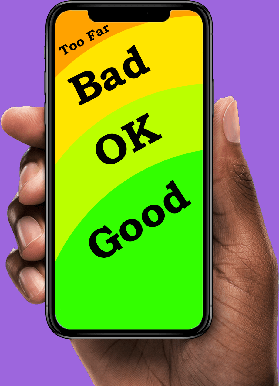
Innovation can quickly become overcomplication, adding in new features can make it become more confusing. The featured image is an extreme interpretation of taking a piece of technology, a microwave, too far.
Innovation of additional features in design and technology is usually viewed as beneficial. If a piece of technology has been shown to work well at purpose 1, maybe it can also be good at purpose 2. From a company's perspective, this makes the most sense to do in a competitive market. If company 1’s technology is competing against company 2's technology, then they need to stand out. If both companies have their technology excel at purpose 1, then an option to stand out is to introduce an additional purpose for the technology. While this may be a good tactic, there is a risk of losing something not often considered, simplicity. In the article, “SaaS Bloat: How Unnecessary Features Are Overcomplicating User Experience,” written by Gaurav Kumar, Kumar discusses the topic of SaaS Bloat, when additional features get added it can cause confusion with general consumers. Even when the features only appear beneficial from an overall perspective, actually utilizing the technology could be complicated.
A while ago, I needed to purchase a new monitor for my laptop to have a bigger screen. I saw the dimensions for the monitor as well as its resolution and purchased it. While there were additional aspects to the monitor, it looked like all the additional parts would just be an optional use. These additions were having different channels built in, such as Hulu or HBO. When I had gotten my monitor, I was distraught to discover that whenever the monitor turns on it has to load all of these channels before being usable. Turning on the monitor would take roughly an entire minute for features that I did not wish for. Additionally, it would start to play advertisements before I can change the HDMI to my laptop, meaning a possible jump scare if a loud advertisement plays. While the monitor works well as a monitor, the additional purposes of this monitor have been an active detriment on my use of the monitor.
A great resource to learn more in depth on this topic is the book “Overcomplicated: Technology at the Limits of Comprehension,” written by Samuel Arbesman. In this book, he talks about the struggles with modern day technology and systems that overcomplicate the lives of everyone. While the book is more on social and societal aspects, it can be reasoned that these criticisms can be shared for overcomplicated designs as well. If positive systems are put in place and meet the needs of what it is trying to do, then why change what is already working? Small additions or improvements here and there can be beneficial, but overtime those small additions can completely transform a system in place.
This is not limited to just monitors. Many pieces of design and technology include features that do not need to be included, such as a microwave that can connect to your phone or a powerbrick with a flashlight. While these additions do not take away anything specific, it does make using the technology harder as an overall. A microwave now needs a phone to function properly or the powerbrick loses out on charge to make sure the flashlight is already ready. It is hard to tell if there is an exact solution for this. With new features to standard technology it causes people to want to buy the new updated piece. If there are no new features added and the first version is already good, why bother buying again? Tupperware is an example of how a successful product can be too great, with the company filing for bankruptcy. In the article, “Lifting the lid on Tupperware’s troubles,“ written by Sumanta Sen, it is discussed that the downfall of Tupperware was caused not by a dissatisfaction with the product, but rather too much satisfaction. If a product is great on release and does not require the user to purchase another or upgrade to another version, then under the current system, it will struggle due to the eventual decrease in demand. To learn more on this exact scenario, this article displays the fall of Tupperware as a brand despite it not being a bad product: Article. This means that, financially speaking, releasing a product with a new feature, a new addition, or a new purpose has some benefit, even if the product barely benefits. Of course I wish for innovation to continue; however, it is a pain to see when innovation is put in when it is not needed. Additional features look good on paper, but in practice it can be the case that the product just becomes confusing. All I can hope for is that in the future designs go back to simplistic designs for specific purposes, not everything needs a kitchen sink.