Designing For The Thumb
When designing for mobile interfaces, for websites or apps, many things need to be considered that do not need to be considered when designing for desktop. A major thing to consider when designing for mobile is how the user will likely hold their phone. When a person is holding their phone, they will most likely be using one or both of their thumbs and using their other fingers as support for the phone. Due to this, the range of motion of the thumb should be considered when understanding where to place elements in a design for mobile.
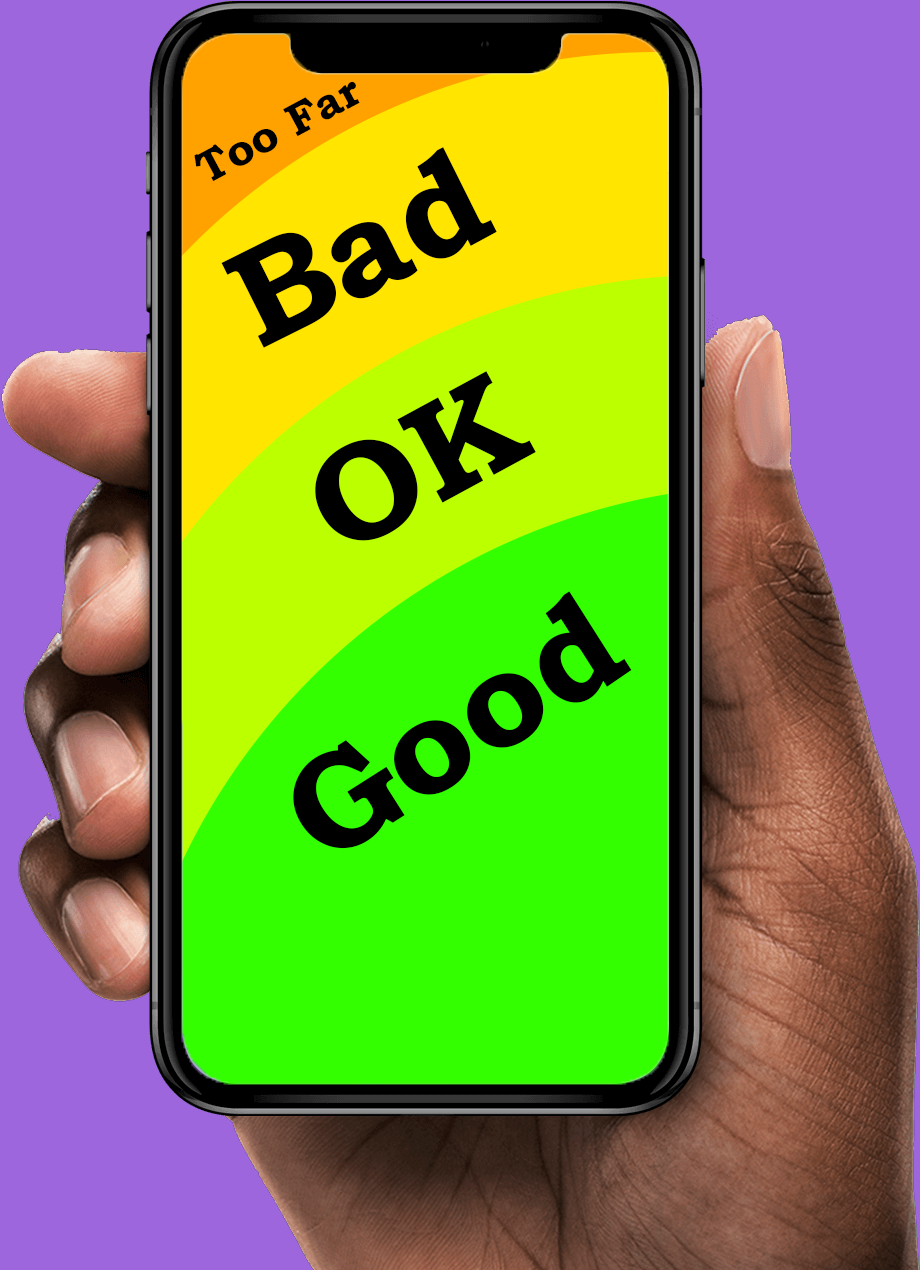
When looking closely at thumb movement, many designers may reference the concept of known as the “thumb zone,” a term popularized by Steven Hoober. Hoober had performed a study in which he observed over a thousand participants using the smartphone as normal. Hoober had found that nearly half of the users exclusively used their thumb to navigate through websites. This research demonstrates that if over half the population of users use their phone in a specific way, then that way should be accommodated for. This helped emphasize the point that the center and lower parts of the screen tend to fall within a comfortable range of motion. On the other hand, the top corners are harder to reach areas for users, especially if it is the opposite corner of the user's dominant hand. When icons or buttons are in those corners, it requires the user to change how they are holding their phone, which is an avoidable annoyance.
Corroborating this idea, an article discusses the Nielsen Norman Group and their multiple publications on usability for mobile users. In these publications, it had also emphasized mobile ergonomics and reachability, in regards to the thumb. Their research highlighted that when designing for mobile design, key interface and key elements should always be within a natural thumb reach. If these elements were to go beyond this normal reach, it would increase friction and cognitive load for the user. Users should not have to be confused or adjust how they are holding their phone to interact with basic or important elements of a website. If the user can access all the information a site has to offer comfortably, then that is a job well done for reachability purposes. There have been several times where I am using an app that has the profile icon at the top corner of the screen, or the search bar a little too high up for me to reach comfortably. While this is a mostly non-issue problem, it is still a problem that could cause annoyance with users who struggle with flexibility and reachability as a general.
Furthering these points, the target size of an icon plays an important role in thumb friendly designs. According to Google’s Material Design guidelines, interactive elements should be sizable enough to understand their silhouette at a distance. This standard is grounded in the idea that in usability testing and ergonomic research, if the person can clearly see the icon that are wanting to press, then they can press it simply and efficiently. The thumb is a big finger, and sometimes a person may accidentally tap on an element that is not what they intended for if the icons are too small. Ensuring that the elements that can be interacted with are big enough so that does not happen is only a positive. Small buttons placed too closely together increase error rates, especially on larger screens.
Finally, the rise in smartphone size over the past decade has further validated the need to design for thumb ergonomics. Screens are increasing and becoming longer, meaning that the top corners of screen will be further from a person’s thumb. So while the person may not have to adjust their had too much inorder to reach the corners of their screen, they may start having to if they get a newer updated phone.Through research on the importance of the thumb is on mobile design and the changing landscape of phone screens, designing for the thumb is not just for a stylistic choice, but it helps on a fundamental level in mobile interface design.